
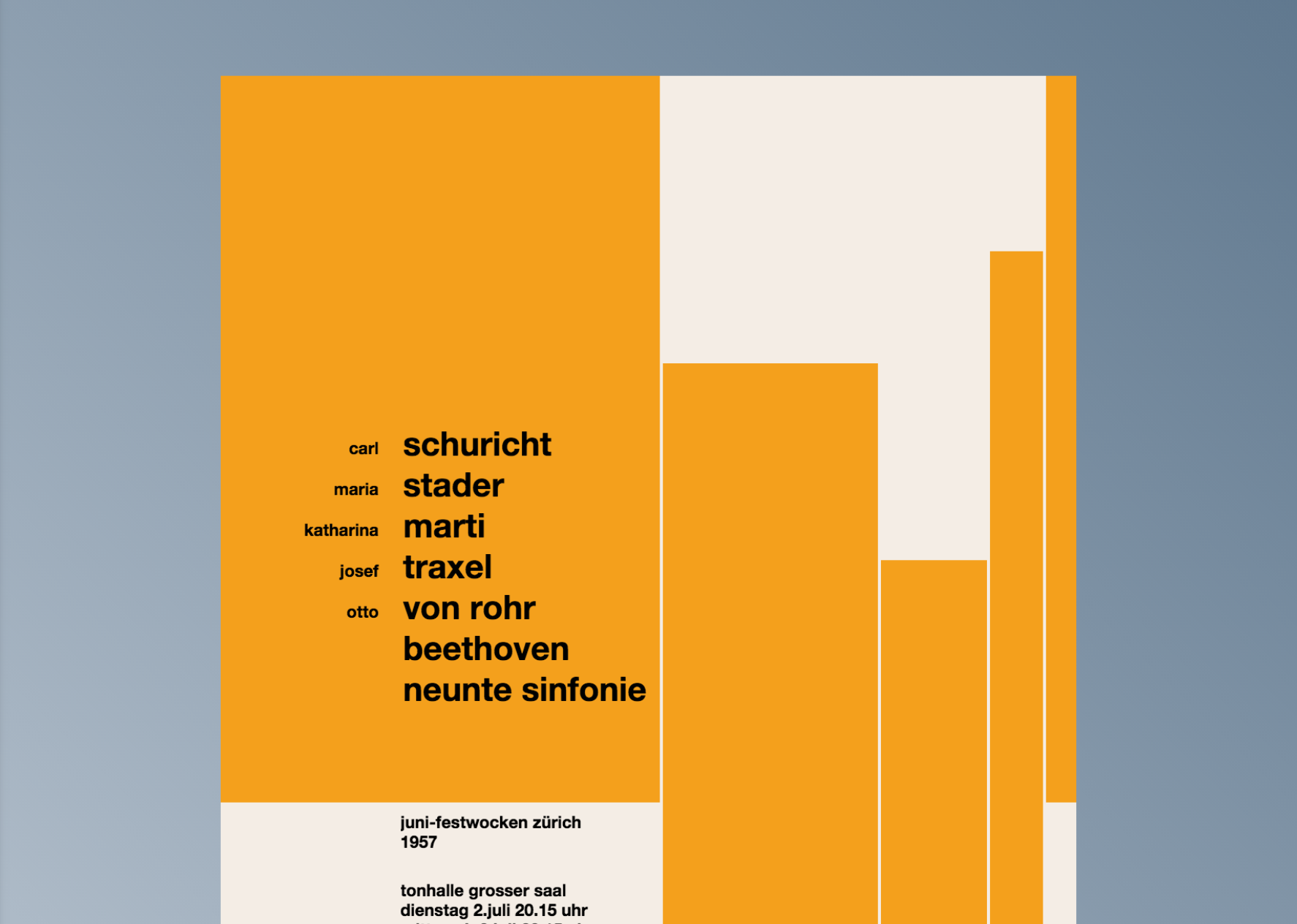
Great example of GSAP animating Josef Müller-Brockmann’s iconic posters. By Aaron Brown.
http://aaronsbrown.github.io/brockmanns-greensocks/
Great example of GSAP animating Josef Müller-Brockmann’s iconic posters. By Aaron Brown.
http://aaronsbrown.github.io/brockmanns-greensocks/
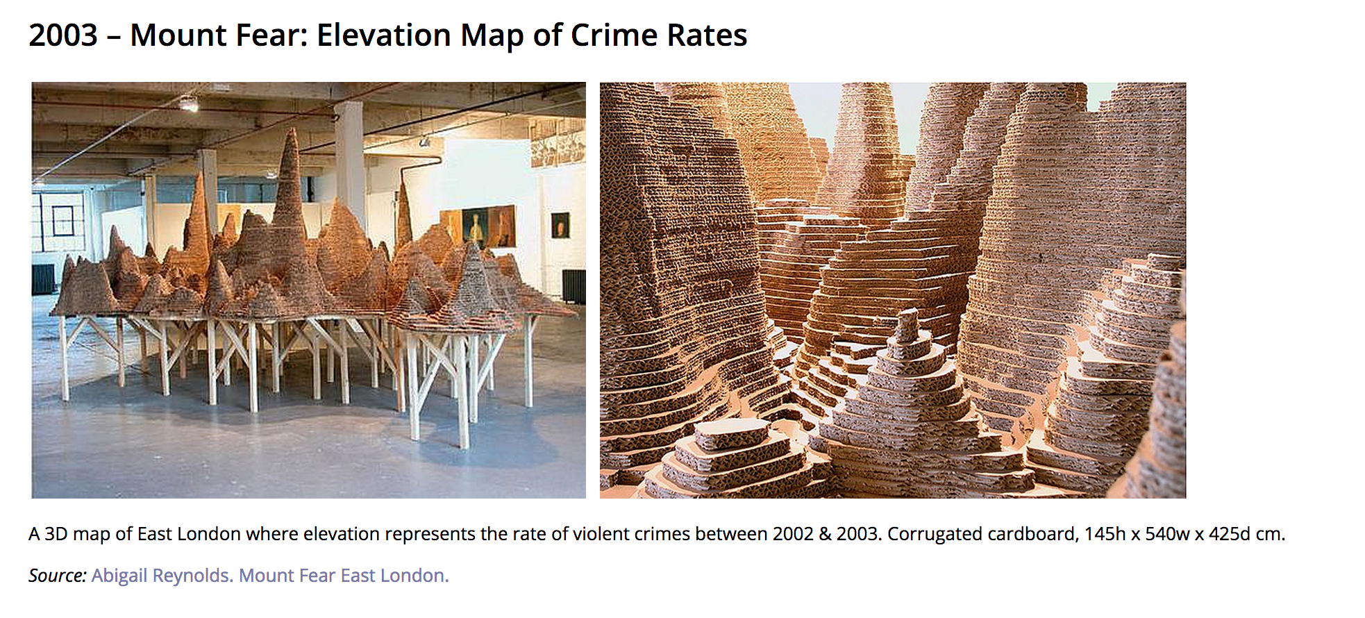
Doing some project research this week and came across this great list of Physical Visualisations from over the years. Some great examples of high and very low tech ways to display data and make it impactful.
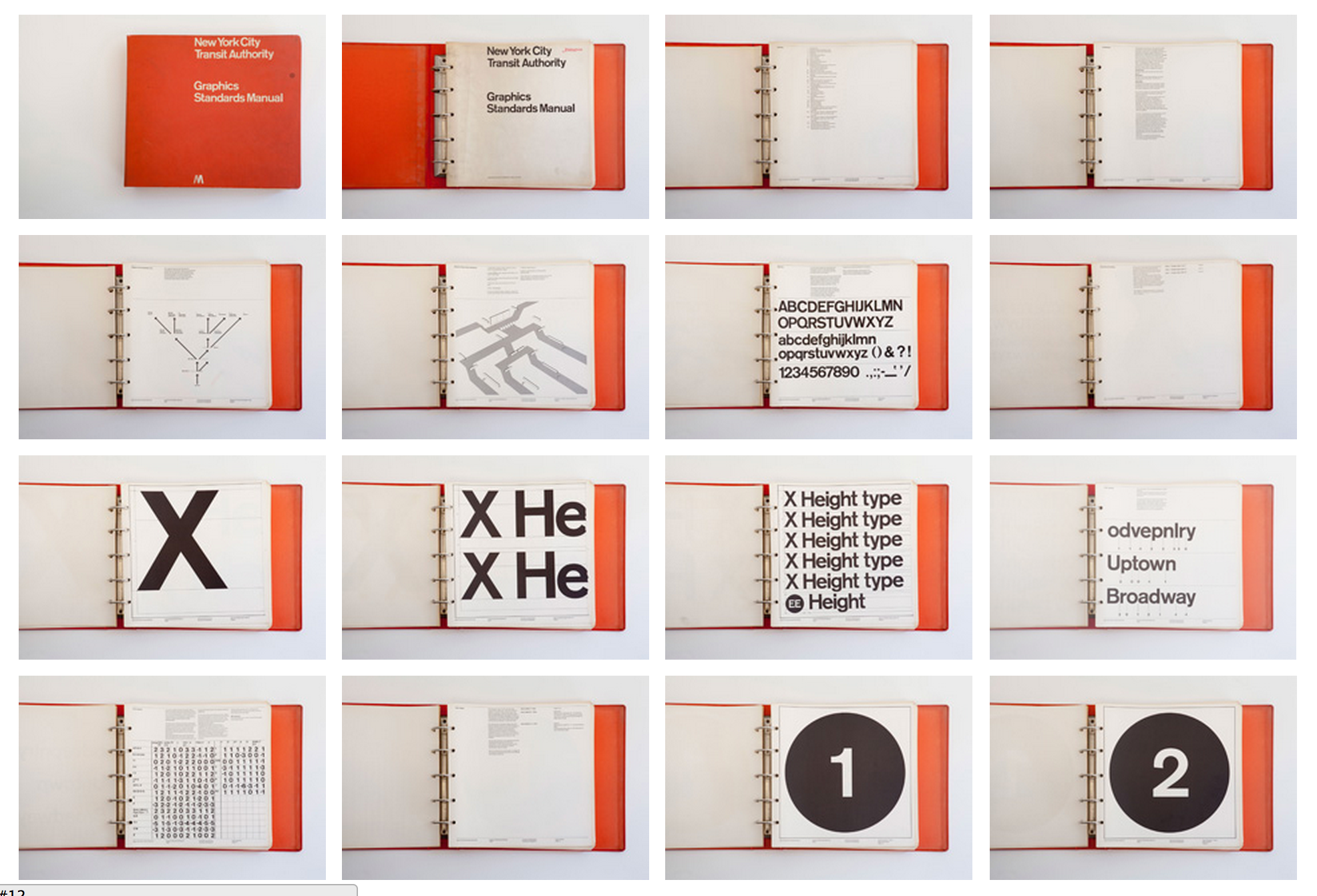
working on a Digital Style Guide today I found this really nice website dedicated to the 1st edition of the New York Transit style guidelines
http://thestandardsmanual.com/
Stumbled upon this cool little grid generator and thought I would share. Nice to have such simplicity and flexibility with options for padding, no padding and push/pull columns. Also comes with LESS compiling option for those inclined.
For the past few years I have been thinking a lot about my direction as a designer and creator, developing new side projects and ways to challenge myself and change my direction. Also thinking about the nature of the medium I work in and where I see myself going in the future.
This leads me to dissect the current state of the web and developers and designers within that space. I often think of the nature of web design we know today as a progression of a language or form of communication (of course it is called HTML :p) and my duty as a designer is to contribute to this new emerging form of communication, shaping how this modern language is received and interacted with.
Sometimes this experience can be great and rewarding, and of course learning structural tools is always good in terms of process (Think grids, semantics etc). It may seem like I’m stating the obvious here but that leads me to think; what are the other opportunities the web holds as a medium?
So much of my time as a designer is spent either creating something that exists within an already predefined structure, what audiences are familiar with, current trends and best practices.
What about using the internet as a tool and blank canvas for creating projects that are unbound by grids, hierarchy and standards and utilizing the web as a canvas to create projects that engage people and grow our connectivity, something the web surely was created to do.
Creating more artistic experiential environments that breaks the normal UX pattern or customer journey where the “goals” or “tasks” are completely thrown out the window, new ideas and possibilities emerge.
Looking through different lenses we can begin to imagine new journeys into the the probable possible and imagined futures of connectivity, expression and interaction.
Going down this road of exploration and discovery hopefully I will have some pretty cool projects to show you along the way…
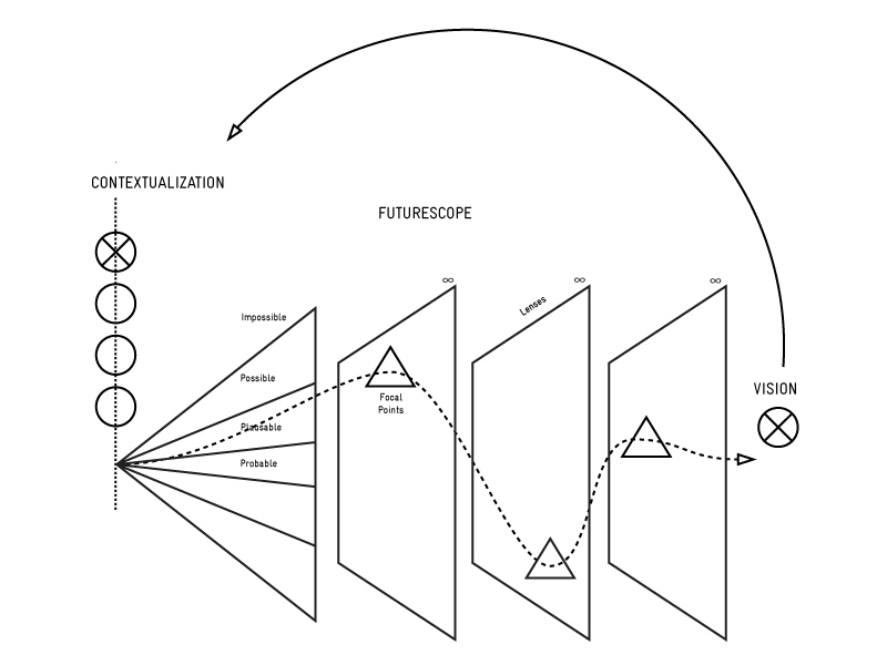
Image courtesy of the extrapolation factory
Woohhoo! If you use Google Web fonts all the time like me you might find this Beautiful type resource from Chad Mazolla a good find!
To continue on the same page as my last post I’ll be looking at several different tip and pointers I have learned when designing for a mobile first experience, something I’m trying to incorporate more into my workflow.
The whole ideology behind mobile first is basically the idea of progressive enhancement. A mobile first approach allows the designer to decide what elements are essential to the goals and functionality of the site then build or progressively enhance the experience from there.
Like any good Design project start with a grid. While a lot of designers (including me) would usually start with a desktop layout and multiple columns a mobile first approach encourages you to start with 1 or maybe 2 columns and build from there.
I guess from a content and wire-framing perspective this approach has allowed me to think more clearly about what content I need to prioritise and what content is less relevant to the user experience, delivering a better core experience overall.
Anyway I thought I’d list a few interesting pointers and bit of advice if stumbled upon over the last while:
One of the most important things concerning a sites visual appeal but also affecting performance time is images. With a fragmented landscape of multiple devices and screen sizes it has become important to tailor your images to whatever screen size your user is viewing the site on. The introduction of srcset allows designer to quickly define what images should be served up at different resolutions. eg.
<img src="photo.png" srcset="photo@2x.png 2x" ...>
Therefore maximizing image quality and download speeds at the same time. A better and more thorough description can be found here
I know myself it was hard to get into the principals of designing responsively and thinking about grid systems etc before diving into the features. So for a really clean and direct approach to grid systems use this. For an more in depth explanation of modern responsive development techniques look to google!
Finally for text based considerations I found this article to be really helpful. It really clearly explains the difference between px, ems and rems and what the advantages are.
Recently I have been watching a lot of typecast seminars. If your a web designer interested in fonts and layout you should definitely check them out.
Mobile first design has become the latest design process in the spotlight with lots of companies and developers adopting a mobile first approach. For those that dont know mobile first is basically designing your content for mobile screens and up rather than desktop screens downwards. The guys at Typecast have some great tips to help developers create the most forward thinking structure to their projects.
While there is a focus on how Typecast can help you design from mobile first (They do need to plug!) What I really like about these seminars is that they look at the wider context and teach principals and approaches that extend from their product focus. Something I find adobe rarely does!
If That sounds interesting you should check out the seminar here.
Heres also some notes and resources I found helpful:
Set a performance budget:
http://timkadlec.com/2013/01/setting-a-performance-budget/
PAGE LOADS: most users wait 4 seconds before giving up and navigating off the page!
Only use weights and typefaces you need to increase download speed…ie dont include all the family weights if you aint usin them!
Image Optimizer– great tool to compress images
Codekit– code compression app
There is no breakpoint– Ben Callaghan
design for “moments”, provide as much context on the page for current moment, use x axis to save space
http://typecast.com/blog/designing-for-moments-with-media-queries
test your responsive designs in the browser!! Unlimited widths to test/view
This is a great tool for Designers and Creative types, especially if you are looking for inspiration around a theme or even to create a simple mood board!
I also recommend you check out this useful post on design tools by the awwwards team:
www.awwwards.com/visual-tools-to-aid-your-daily-inspirational-process
Just landed in NYC I went to see the new Kara Walker Exhibition in Brooklyn. Set in an old Sugar factory the piece explores the buildings history and the workers behind the sugar, from cane fields to new world factories exploring old world relationships and iconography from a time passed.
It was definitely one of the most interesting and visually impactful exhibitions I have went to in ages and the building alone is impressive. Take a walk down to Williamsburg if you are in New York and see it for yourself!
 theoneandonlynaoise